Duration: 3 months
Expertise: UX/UI Design
Tools: Figma
Project Overview
The case study presented here was my first UX case study and was developed during the UX Design course at Awari, mentored by Veronica Sartori
The choice of topic came from the observation of the behavior of vegetarians and vegans, as well as their cooking and shopping habits and how it affects their lives. Thus, Achados Veganos was born: a collaborative platform that helps users discover vegan products. Below, you will read the complete description of how the product was conceived, with a step-by-step analysis of all the Design processes adopted, ending with a high-fidelity navigable prototype.
Evidence For The Problem
The vegan market is booming. According to the Vegan Food Global Market Report 2021, it is expected to grow by $1.33 billion in 2021. Google AdWords data shows that the number of related searches grew 47% in 2020 compared to the previous year. In addition, from 2015 to 2020, this increase was over 2000% in global searches, according to research developed by the company Thorthful. According to Baum+Whiteman’s 2021 trend report, which predicts which foods and beverages are at the highest in 2021, “vegan and vegetarian product sales are skyrocketing” (free translation).
Despite being a growing market, these consumers still face several problems, and, according to a survey by Faunalytics, around 84% abandon this way of life. This study presents several reasons people abandon veganism and why they would consider trying again, and food is a major factor. People who abandoned veganism/vegetarianism were mostly dissatisfied with their food, and food would be a decisive factor to return.
Discovery
Research Strategy
To better understand my audience and current scenario, I used the following research methods:
- Competitor analysis
- Quantitative survey
- Qualitative interview
Competitors Analisys
The main findings were:
- Most apps don’t have a Portuguese version.
- Don’t work well and that’s why there are a lot of negative comments on the ratings.
- Don’t have data on national brands, which makes it difficult to search for products.
- Very focused on just one segment. Some apps have a feature to search for products, however, they only cover cosmetics or food.
Quantitative Survey
For this stage, I created a questionnaire that had 206 responses, leading to a confidence level of 85% with a margin of error of 5%.
Some interesting data:
- 72% want to become vegan
- 36% said that having the information faster and more concentrated could make their life easier
- 92% said that they use Google to find information
- The biggest difficulty pointed out was “food” followed because the information is very dispersed
Qualitative Interviews
After gathering the data acquired in the quantitative survey, I interview 6 people: 1 vegan, 1 vegetarian, 2 ovolactovegetarians, and 2 flexitarian/sympathizers. The interview took about 30min and was done by video.
Key Insights:
- “My process of becoming a vegan was very natural and in my time.” -A.F.
- “Sometimes it takes me hours to find information about some products.” -L.M.
- “I look for information on blogs, but I don’t trust it too much.” -L.A.
- “I don’t think I have enough information to say that I’m vegan.” -A.L.
Define
Personas and Empathy Map
The information collected during the research process enabled the creation of two different depersonas and their respective empathy maps. Both of them have profiles that fit the result gathered during the research phase and will support future design decisions for the product.
Job Stories
In this phase, I defined the major actions that users would need to accomplish to achieve the desired goal when using the platform. I defined the major problems diagnosed during the research process, understanding the context, what would motivate the user to use this functionality and the expected result of this action. Some objects were:
- Search for products;
- Explore new products;
- Receive recommendations;
- Save products to buy it later;
- Know if a product is good;
- Evaluate a product;
This method was mainly used to list the main user actions when using the platform, which was used in the information architecture process. Besides that, it helped to define the MVP (minimum viable product) aligned with the needs of the personas created previously.
User Flow and Sitemap
I created a Sitemap to illustrate the hierarch inside the app. After that, o illustrate the navigation flow, I have detailed the main and secondary journeys to be followed by users. Despite later changes, this step was crucial to have a logical starting point for the information architecture.
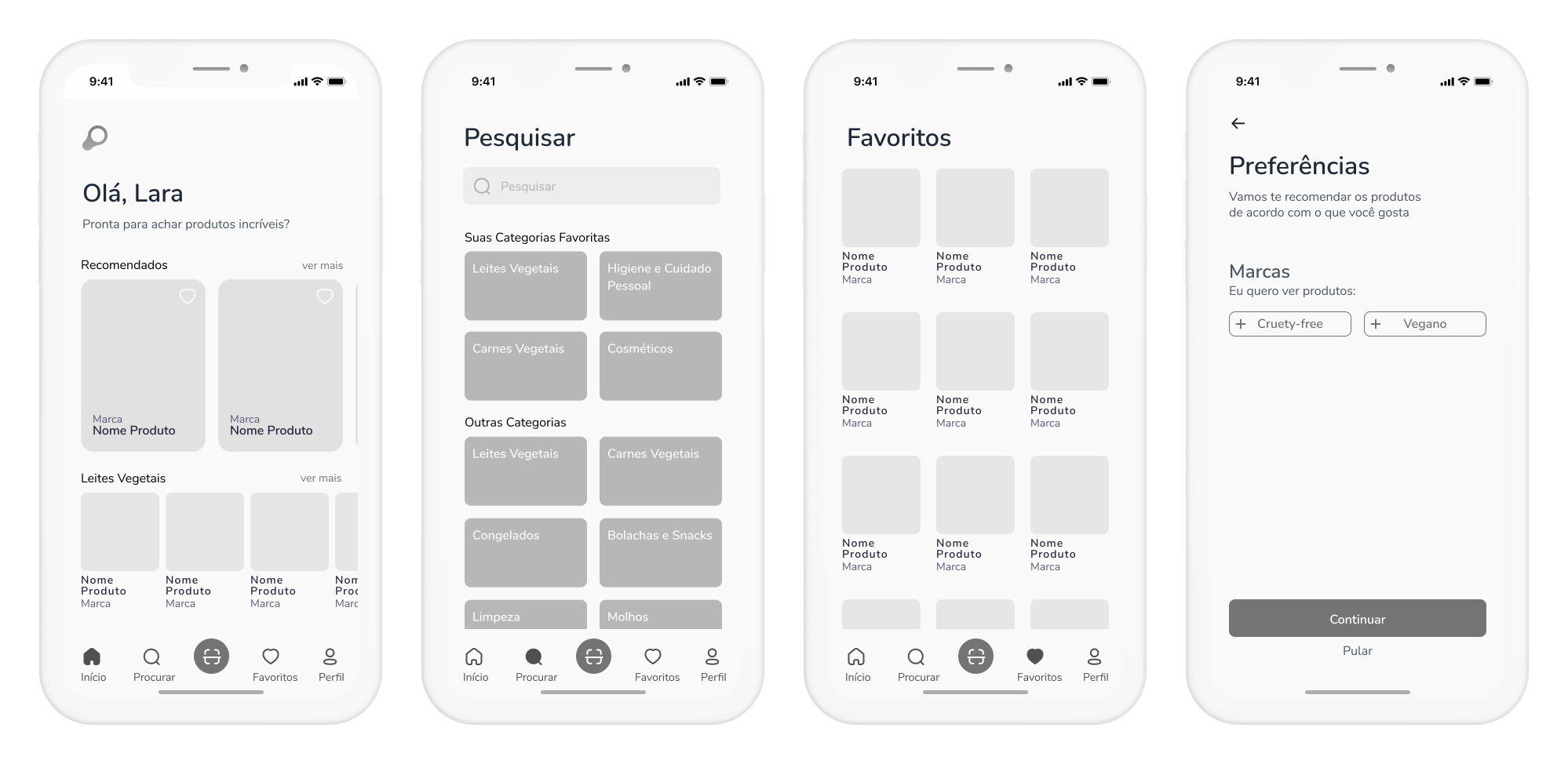
Wireframes
After finishing the initial sketches, I migrated to Figma and started creating the screens where I could define the structure of the application’s content, the components to be used, and how they talk to the user. Besides that, I created the major interactions that allowed for navigation between the major segments of the platform.
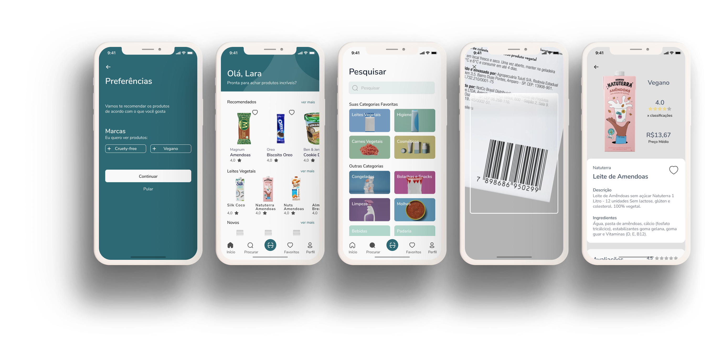
Prototype
After finishing the wireframes, I started creating the high fidelity prototype. You can find the final prototype of this project here.
What I Learned in This UX Case of Study
This was my first, so I’m very happy with the result of the project and with all the knowledge acquired through this challenge. The entire process was a challenge and I’m proud that I could defeat it.
One of the main learnings was: never fall in love with your solution. I started this UX case thinking that I would create a recipe app, however, I ended up with some completely different which I’m very proud off.